Interpretation of various learning rates
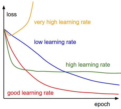
When examining learning rate graphs, several distinct patterns emerge that provide valuable insights into model training dynamics:
- Very high learning rate (yellow curve) typically produces diverging loss that increases over time, indicating unstable optimisation where parameter updates overshoot minima and potentially cause numerical instability.
- High learning rates (green curve) show rapid initial progress followed by oscillation or plateauing, suggesting the model approaches optimal regions quickly but lacks the precision to settle properly, bouncing around like a ball with too much energy.
- Good learning rates (red curve) display steady, consistent decreases that eventually flatten at low values, representing an ideal balance between speed and stability that allows the model to converge efficiently.
- Low learning rates (blue curve) produce very slow, almost linear decreases in loss, indicating cautious parameter updates that never overshoot but require significantly more computational resources and training time.