from sklearn.datasets import load_wine # Load the wine datasetwine_data = load_wine()X = wine_data.datay = wine_data.targetfeature_names = wine_data.feature_namestarget_names = wine_data.target_names# print to check the overall structure of our dataset# and also to find how many classes we haveprint(f"Dataset dimensions: {X.shape}")print(f"Target classes: {target_names}")
import pandas as pd# Data preparationdf = pd.DataFrame(X, columns=feature_names)df['target'] = ydf['target_names'] = df['target'].map({0: 'class_0', 1: 'class_1', 2: 'class_2'})df.head()
alcohol
malic_acid
ash
alcalinity_of_ash
magnesium
total_phenols
flavanoids
nonflavanoid_phenols
proanthocyanins
color_intensity
hue
od280/od315_of_diluted_wines
proline
target
target_names
0
14.23
1.71
2.43
15.6
127.0
2.80
3.06
0.28
2.29
5.64
1.04
3.92
1065.0
0
class_0
1
13.20
1.78
2.14
11.2
100.0
2.65
2.76
0.26
1.28
4.38
1.05
3.40
1050.0
0
class_0
2
13.16
2.36
2.67
18.6
101.0
2.80
3.24
0.30
2.81
5.68
1.03
3.17
1185.0
0
class_0
3
14.37
1.95
2.50
16.8
113.0
3.85
3.49
0.24
2.18
7.80
0.86
3.45
1480.0
0
class_0
4
13.24
2.59
2.87
21.0
118.0
2.80
2.69
0.39
1.82
4.32
1.04
2.93
735.0
0
class_0
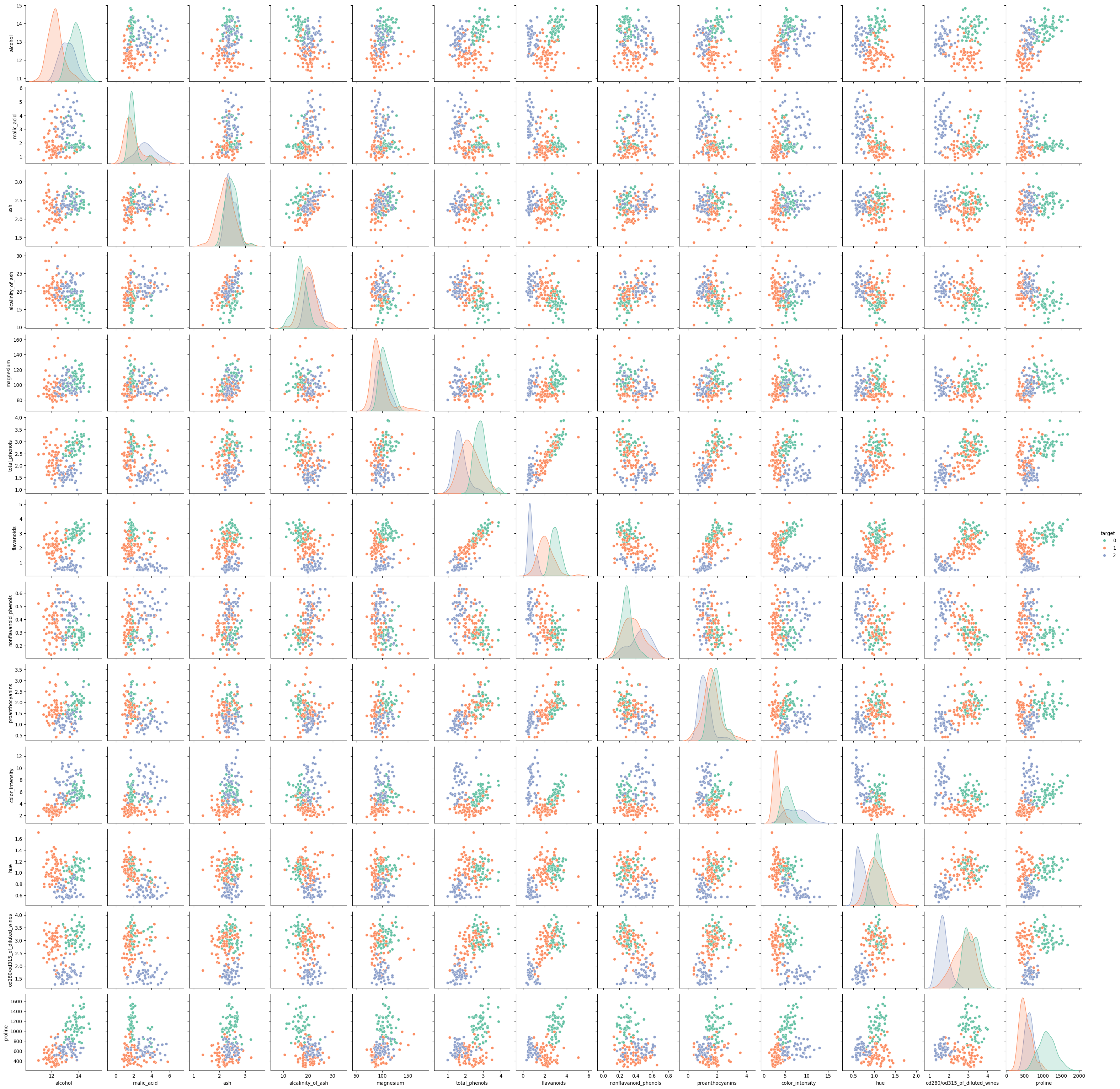
from seaborn import pairplot# Scatter plots - visualize potential correlations or patterns between features# The diagonal of the pairplot displays the distribution of each featurepairplot(df, hue ='target', palette ='Set2', diag_kind ='kde')
# print to check the target classes distributionsprint("\nTarget distribution:")print(df['target_names'].value_counts())
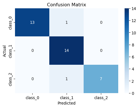
from sklearn.model_selection import train_test_split # Split into train and test setsX_train, X_test, y_train, y_test = train_test_split(X, y, test_size=0.2, random_state=42)print(f"Training set shape: {X_train.shape}")print(f"Testing set shape: {X_test.shape}")
Training set shape: (142, 13)
Testing set shape: (36, 13)
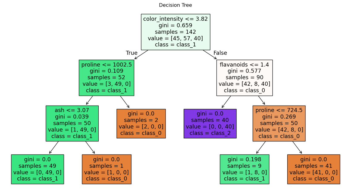
2. Train the Decision Tree Model
from sklearn.tree import DecisionTreeClassifier # Create and train a decision tree classifier with max depth of 3tree = DecisionTreeClassifier(max_depth=3, criterion='gini', random_state=42)tree.fit(X_train, y_train)
In a Jupyter environment, please rerun this cell to show the HTML representation or trust the notebook. On GitHub, the HTML representation is unable to render, please try loading this page with nbviewer.org.
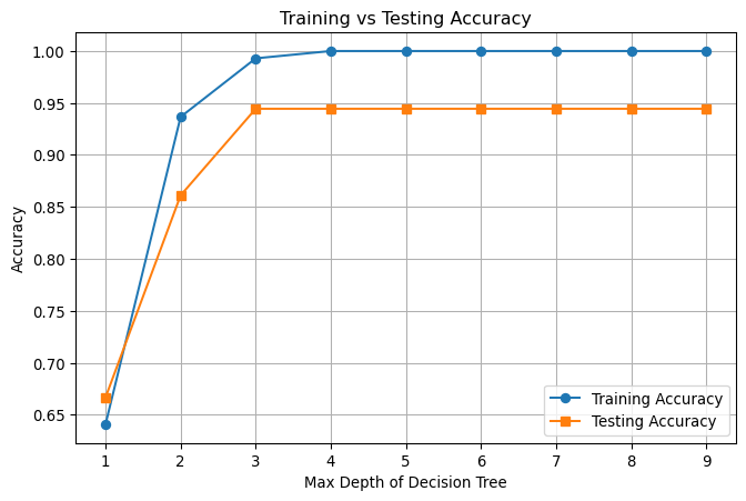
# Train Decision Trees with different depths and record accuracymax_depth_range =range(1, 10)train_accuracies = []test_accuracies = []for depth in max_depth_range: clf = DecisionTreeClassifier(max_depth=depth, random_state=42) clf.fit(X_train, y_train)# Predict on training and testing data train_pred = clf.predict(X_train) test_pred = clf.predict(X_test)# Accuracy scores train_acc = accuracy_score(y_train, train_pred) test_acc = accuracy_score(y_test, test_pred) train_accuracies.append(train_acc) test_accuracies.append(test_acc)# Plot training vs testing accuracyplt.figure(figsize=(8, 5))plt.plot(max_depth_range, train_accuracies, label='Training Accuracy', marker='o')plt.plot(max_depth_range, test_accuracies, label='Testing Accuracy', marker='s')plt.xlabel('Max Depth of Decision Tree')plt.ylabel('Accuracy')plt.title('Training vs Testing Accuracy')plt.legend()plt.grid(True)plt.show()
As we can see, the decision tree performs fairly well on the wine data and the accuracy doesn’t change after max_depth > 3. This is because the wine data from scikit-learn is fairly simple and clean. However, this is not common in real life, where data are more complex and noisy.